SCOPE OF WORK: Brand Development • Visual Identity • Product Storytelling • Art Direction • Creative Scalability
Brand Evolution
PHYSICIAN'S CHOICE
This project follows the five-year evolution of Physician’s Choice's flagship probiotic product on Amazon. As the company grew, I helped refine the product gallery, messaging, and overall visual direction to create a clearer, more consistent experience for customers. What began as a series of improvements to a single product listing ultimately helped shape a visual and messaging framework that influenced product launches, marketing campaigns, and brand communications across the business.

-
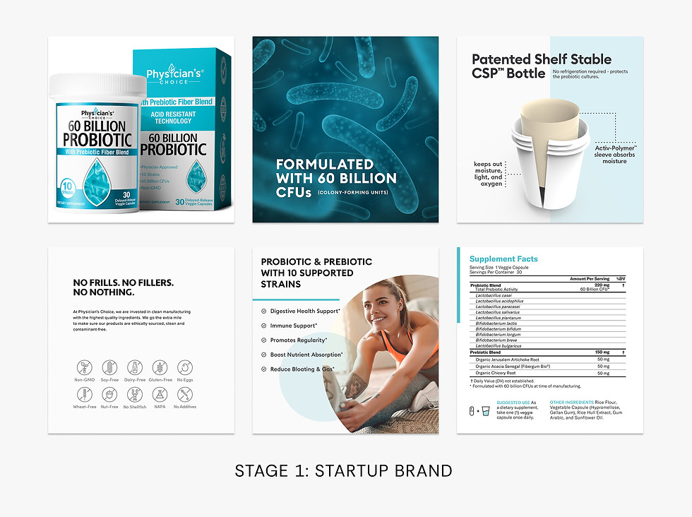
Inherited educational Amazon content focused on efficacy and scientific differentiation, with opportunities to improve clarity.
-
Existing visuals covered CFU counts, strains, and shelf-stable tech, but lacked intuitive communication.
-
Foundational structure supported a complex category but needed simplification for better comprehension.
-
Reframed messaging around digestive wellness and everyday needs.
-
Added comparison tools to simplify navigation across the product ecosystem.
-
Expanded lifestyle imagery to strengthen emotional engagement.
-
Improved hierarchy for easier mobile scanning of key benefits.
GUIDED BY CONSUMER RESEARCH
Between Stages 2 and 3, we conducted consumer research to better understand what shoppers look for when choosing a probiotic. The insights helped reshape our content strategy, placing greater emphasis on the information customers found most valuable and influencing the direction of future product and brand communications.


-
Refined the visual identity through updated typography, photography,
and art direction. -
Shifted toward more approachable, customer-focused messaging.
-
Simplified educational content while creating a more cohesive brand experience.
-
Refined the gallery into a clearer, more focused brand experience.
-
Highlighted key differentiators through simplified messaging.
-
Strengthened consistency across packaging and digital channels.
-
Introduced a brighter, more vibrant color palette informed by testing and performance insights.
Scaling Beyond the Flagship SKU
Through this process, I was able to build a templated system that was later applied across the complete Physician’s Choice portfolio. As new products launched, the visual approach, content structure, and customer-focused storytelling established here became a foundation for creating a more consistent brand experience.

