Brand Evolution
PHYSICIAN'S CHOICE
MY ROLE: DESIGN | ART DIRECTION
This project follows the five-year evolution of Physician’s Choice's flagship probiotic product on Amazon. As the company grew, I helped refine the product gallery, messaging, and overall visual direction to create a clearer, more consistent experience for customers. What began as a series of improvements to a single product listing ultimately helped shape a visual and messaging framework that influenced product launches, marketing campaigns, and brand communications across the business.
Brand System Evolution
PHYSICIAN'S CHOICE
As Physician’s Choice grew, its visual identity needed to grow with it. Early Amazon creative was functional but lacked a distinct, recognizable point of view. Throughout my time at PC, I worked with cross-functional teams to evolve the product gallery, messaging, and visual direction into a more cohesive, consumer-focused system. What began with a single product listing ultimately helped shape a framework that influenced product launches, campaigns, and brand communications across the business.


Guided by Consumer Research
Between Stages 2 and 3, we conducted a focus group to better understand what shoppers actually look for when choosing a probiotic. The results were surprising: customers cared more about strain diversity than we'd expected, and less about the shelf-stable technology we'd been leading with. That insight reshaped the content strategy — leading with benefits customers understood immediately, while moving technical claims like shelf-stability deeper into supporting content.


Extending the System Across the Brand
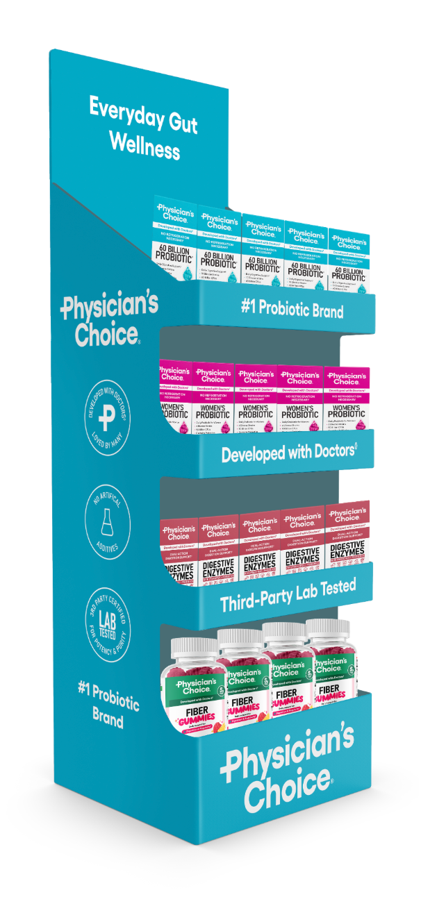
The visual system developed through the flagship refresh became a foundation for how Physician’s Choice showed up across digital touchpoints. The same approach to color, typography, content hierarchy, and customer-focused storytelling extended into social, Amazon, the website, email, and more, creating a more cohesive brand experience wherever customers encountered us.

Extending the System Across the Brand
The visual system developed through the flagship SKU refresh became a foundation for how Physician’s Choice showed up across digital touchpoints. The same approach to color, typography, content hierarchy, and customer-focused storytelling extended into social, Amazon, the website, email, and more, creating a more cohesive brand experience wherever customers encountered us.

Shopify PDP

Amazon Carousels

Amazon A+ Content

Amazon Brand Story

Amazon Carousel Video
Retail Design

Social Feed

Website Module

Slide Decks

Website Module